There are two main schools of thought when it comes to analyzing stocks. One school of thought uses fundamental analysis to analyze companies and attempt to value how much a company is worth and, hence, the price the stock should sell for. The other school of thought is called Technical Analysis, which uses tools such as chart patterns and trend analysis to project future trends in stock prices.
Fundamental Analysis
Uses economic data, historical financial information found in financial statements, financial projections, to determine intrinsic or fair value of a company.
Technical Analysis
Highly depends on current market psychology and investor sentiment in choosing a stock.
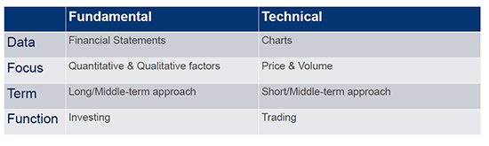
If you’re like many new investors, you’re probably wondering who uses technical analysis and who uses fundamental analysis? In general, fundamental analysis is applied by long-term investors, while technical analysis is mostly applied by short- and mid-term traders. The below chart breaks down some differences between fundamental and technical analysis:
Why technical analysis?
There is a theory that the stock market is “efficient”; this would mean all investors in the stock market behave in a “rational” manner. The problem with the efficient market hypothesis (EMH) is that it doesn’t factor in important drivers such as human emotions. Those who rely on technical analysis believe less in an efficient market and more in market psychology as a driver of stock prices.
Market psychology uses human psychology to measure the sentiment of the stock market, and to project future market prices. These are believed to be identifiable as they recur in the form of price patterns that can determine the trend and direction of the market.
Herding
An important concept under market psychology involves market herding. The concept of market herding assumes that many market participants don’t do their own research, but, rather, they follow what others are doing. This creates a herd mentality wherein investors follow investments made by others, instead of thinking independently. Herding goes against the efficient market hypothesis.
Three Principals of Technical Analysis
There are three main principles of technical analysis:
- Market action discounts everything
The price of an asset discounts all known news, whether it be fundamental (company’s financial results), political, economic, psychological, and otherwise.
- Prices move in trends
Technical analysts believe prices move in short-, medium-, and long-term trends. In other words, a stock price is more likely to continue a past trend than move erratically. Most technical trading strategies are based on this assumption.
- History repeats itself
Price movements can be attributed to market psychology and market participants react in a consistent manner to market stimuli over time. These price patterns become repetitive over time and across asset classes.
Technical analysis uses market psychology and concepts like herding to explain market sentiment. Trading relies heavily on human behavior and market psychology, which rely on the view that humans react in similar ways to similar situations. This human behavior and tendency to react in similar ways leads to predictable behaviors. These behaviors are seen in the market through market patterns, which is why traders use patterns to project or predict future price action.
Some important tools technical analysts use to measure and predict trends include charts, patterns, and trends.
Three types of charts
There are three main charts that technical analysts use.
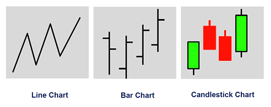
While each of the charts above can be important, the line chart and candlestick chart are the most widely used by traders. The line chart is easy to understand, as it simply shows the changes in prices (often times closing prices). Since traders care about both price changes (the opening and closing price of a stock) and the price movement of a stock during a specific timeframe, candlestick charts are often used. Candlestick charts help traders visualize price changes over periods and, since they are a bit more complex, we will discuss candlestick charts below.
Candlestick Charts
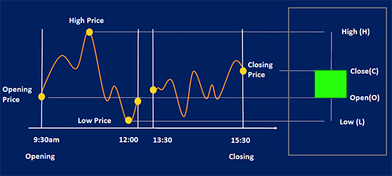
The above graphic shows how candlestick charts work. On the left side you can see the price movements of a stock during a trading day. It shows the opening price, the high, low, and closing price. The candlestick is a powerful tool because it is a way to visualize all four of these points in one small visual. On the right side you can see the green candlestick. The bottom tail depicts the low for the day, the start of the lower body shows the open for the day, the top of the body shows the close, and the top tail shows the high for the day. The color of the candlestick is important as it depicts a positive or negative day. The colors used here are green (up day) and red (down day).
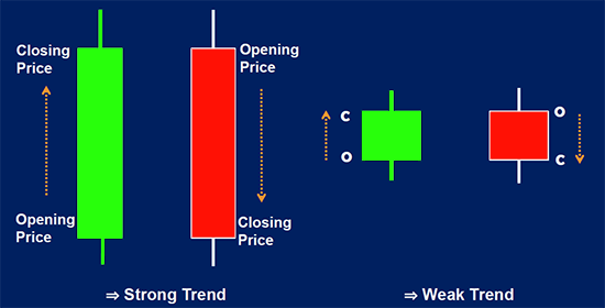
As you can see, the green candlestick shows a stock that closed at a higher price than it opened. The red candlestick closed at a lower price than it opened. Candlesticks are a great way to visualize the range a stock moves during a specific time period.
To better understand how candlesticks can work with time periods, we can view the below graphic.
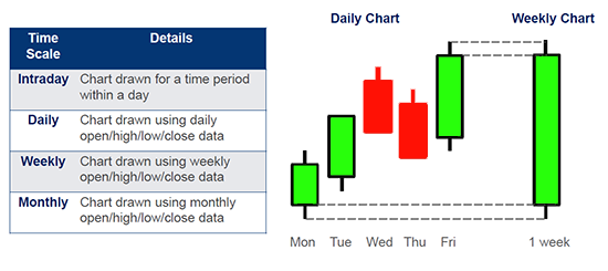
As you can see, a candlestick can be visualized as anything from intraday and daily, to weekly and monthly. The candlestick chart time scale you choose may depend on how short or long you hold positions before you sell or your trading style. Between candlestick charts, line charts, and bar charts, you may be wondering which type you should choose. In general, it comes down to personal preference. Traders will sometimes look at both line charts and candlestick charts, or line charts and bar charts. Since bar and candlestick charts show the same general data, you can use whichever chart you prefer.
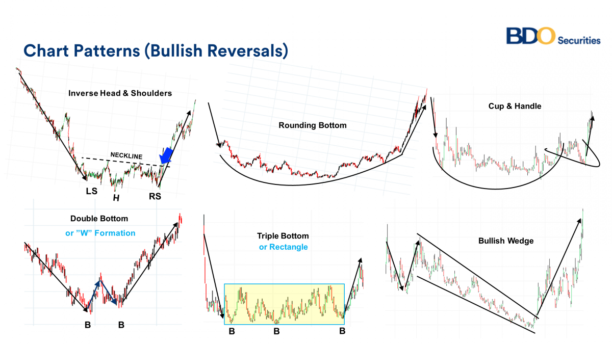
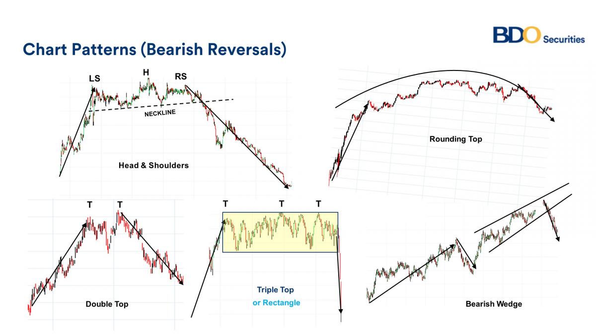
Chart Patterns
Technical analysts use chart patterns to target potential trades. They can help traders pinpoint potential entry and exit points as well as whether the stock may reverse (reversal pattern) or continue (continuation pattern) its price movement.
There are two main chart patterns. Each of these patterns can be either bullish or bearish.
- Reversals
o Bullish Reversals
o Bearish Reversals
- Continuation Pattern
o Bearish Continuation
o Bullish Continuation
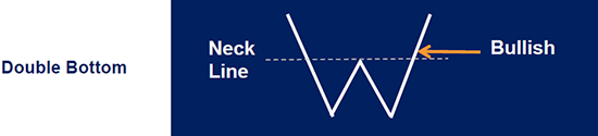
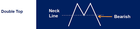
Bullish vs. Bearish Reversal
The below graphic shows a bullish double bottom pattern vs. a bearish double top pattern.
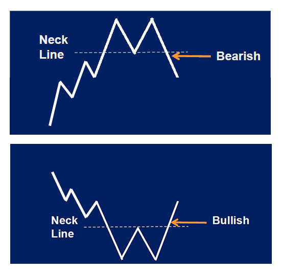
The bottom graphic shows a bullish reversal pattern. This would be a potential bullish trade that could lead to profit. The top graphic shows a bearish reversal pattern. This may be signal a price you may not want to buy considering it has potential to lose value.
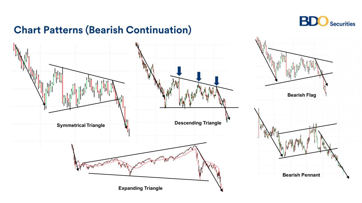
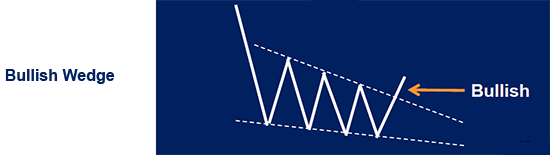
Bullish vs. Bearish Continuation
The below graphic shows a bullish falling wedge and a bearish rising wedge.
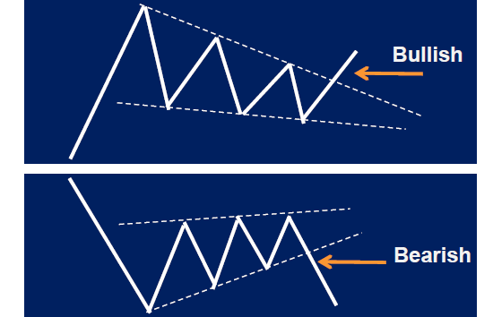
The bullish and bearish wedges are continuation patterns. The top graphic (bullish falling wedge) shows a bullish pattern which could lead to a gain if purchased. The bottom graphic (bearish rising wedge) shows a bearish pattern which could lead to a loss if purchased.
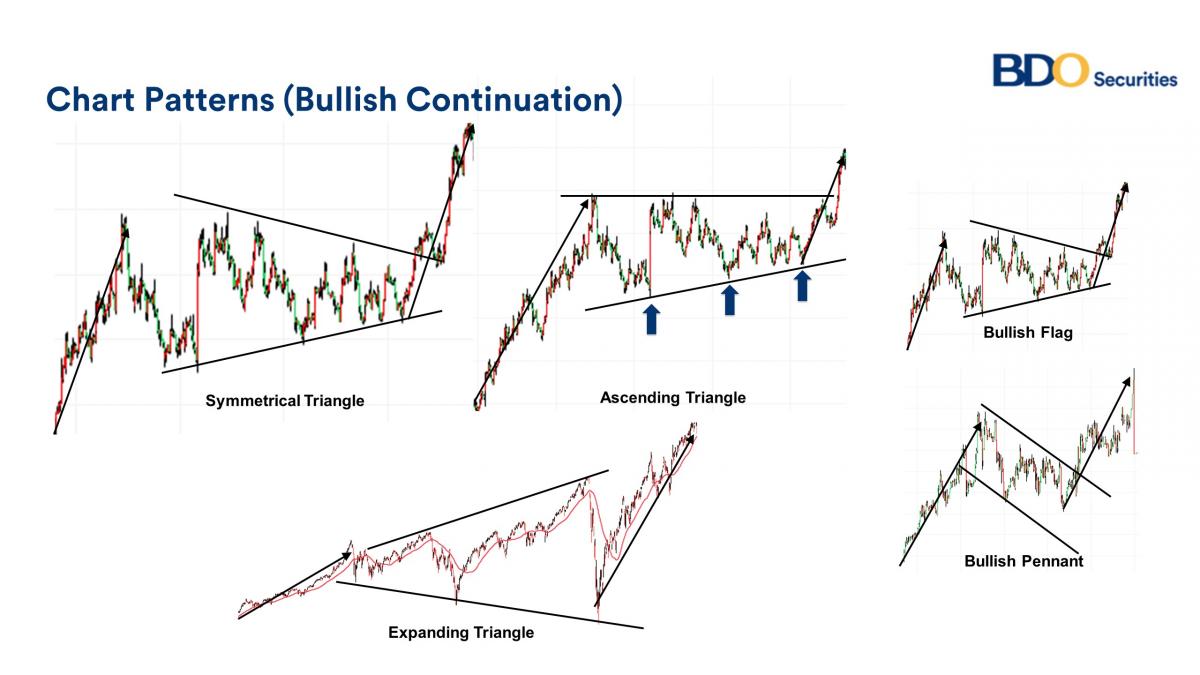
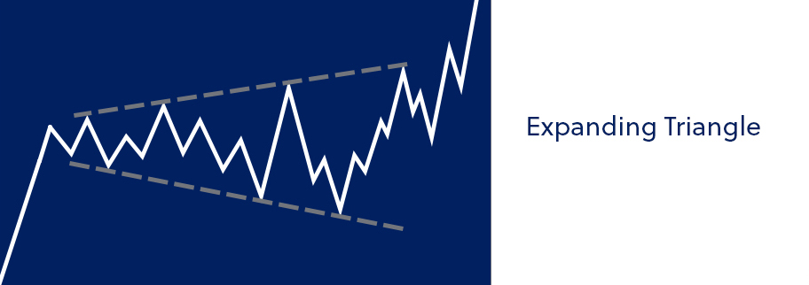
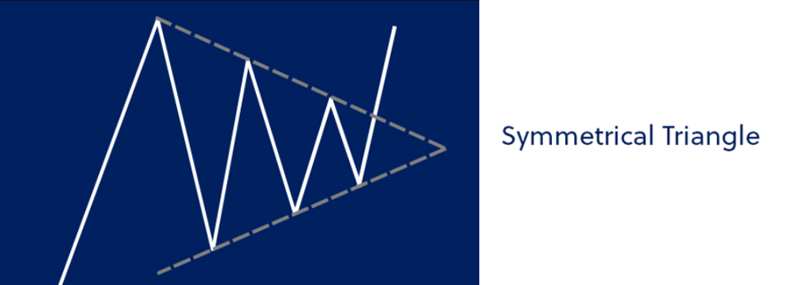
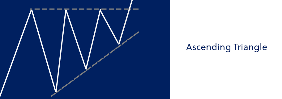
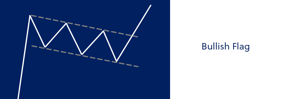
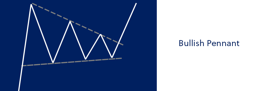
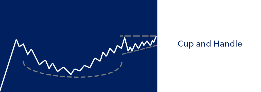
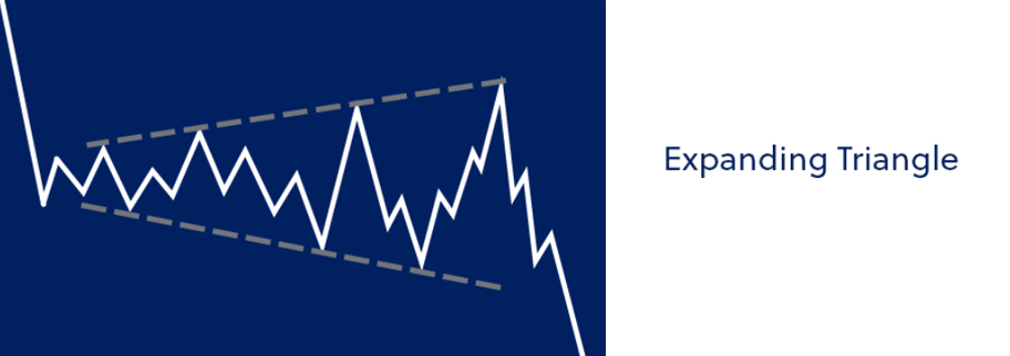
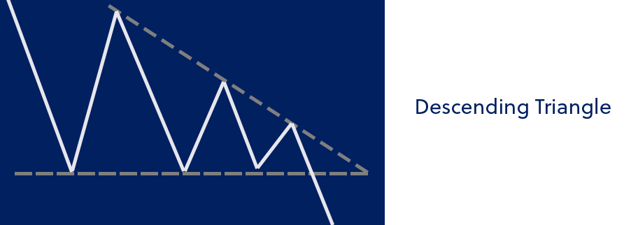
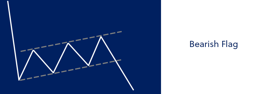
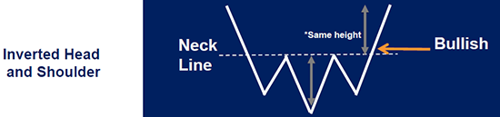
There are a variety of different patterns used by market technicians. Some other patterns include (but are not limited to):
- Triangles
- Pennants
- Flags
- Wedges
- Double top & bottom
- Head and shoulders
To learn more about the above chart patterns, read through our technical analysis category.
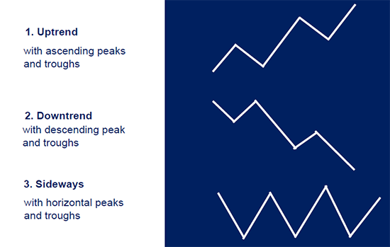
Trend Analysis
There are three distinct trends seen in technical analysis.

The above trends show the direction of prices given the trend. The uptrend line show a rising stock price, the downtrend line shows a falling stock price, and the sideways trend shows neutral price movement for a stock over a given timeframe. When it comes to trends, there are three different timeframe classifications.
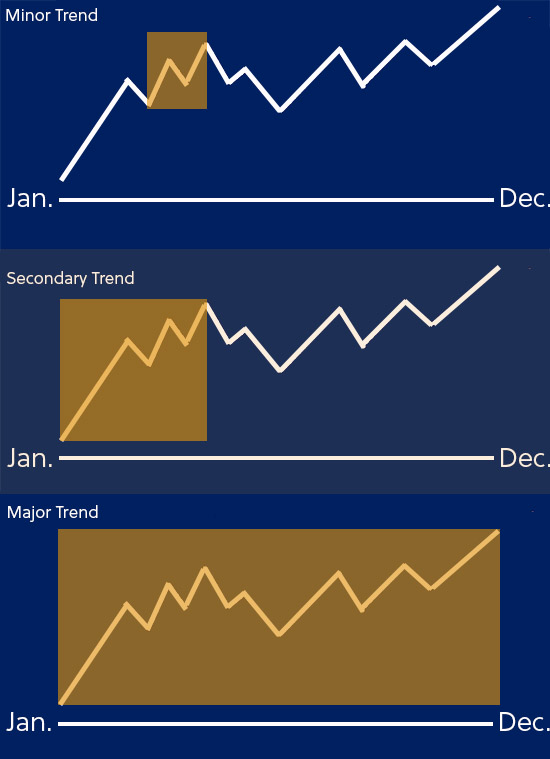
- Minor trend (<2 or 3 weeks)
- Secondary Trend (3 weeks – several months)
- Major trend (>1 year)

The above graphic shows the three different trends.
- The top chart shows a minor trend (a few weeks).
- The middle chart shows a secondary trend (a few months).
- The bottom chart shows a minor trend (1 year).
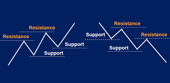
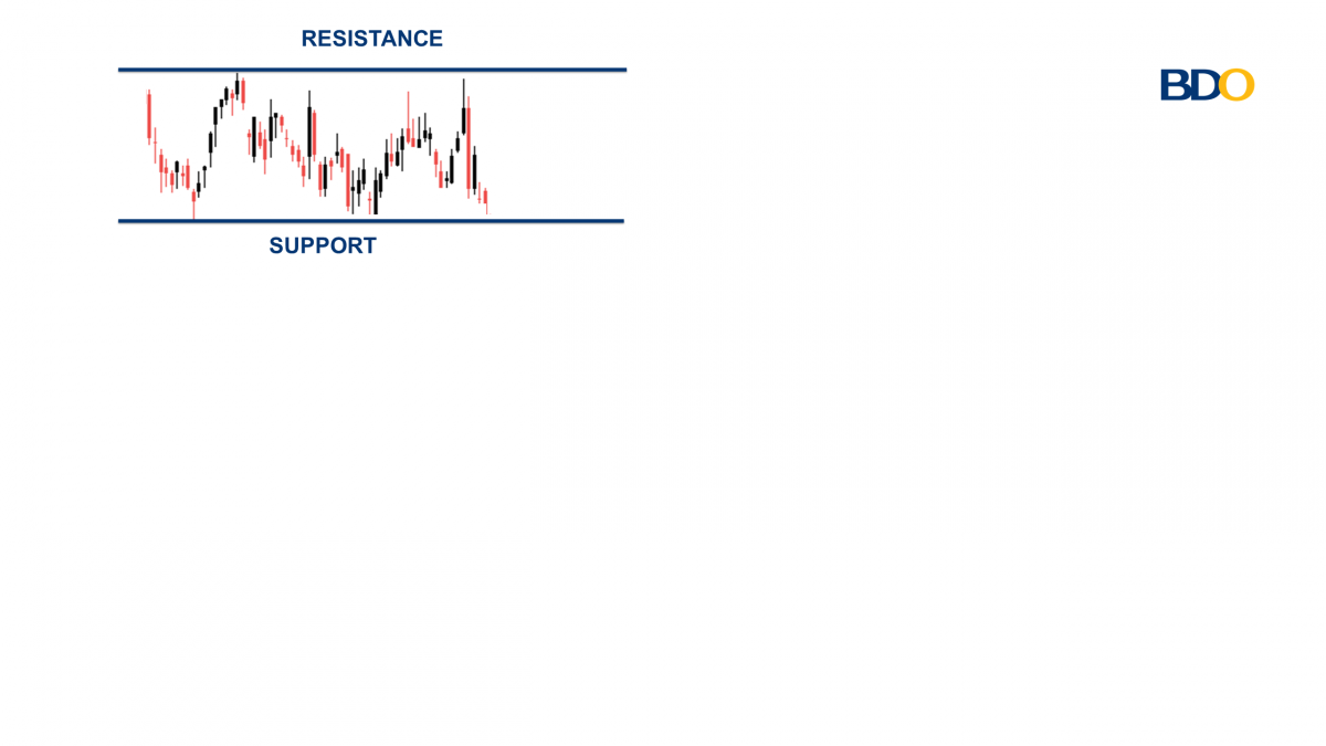
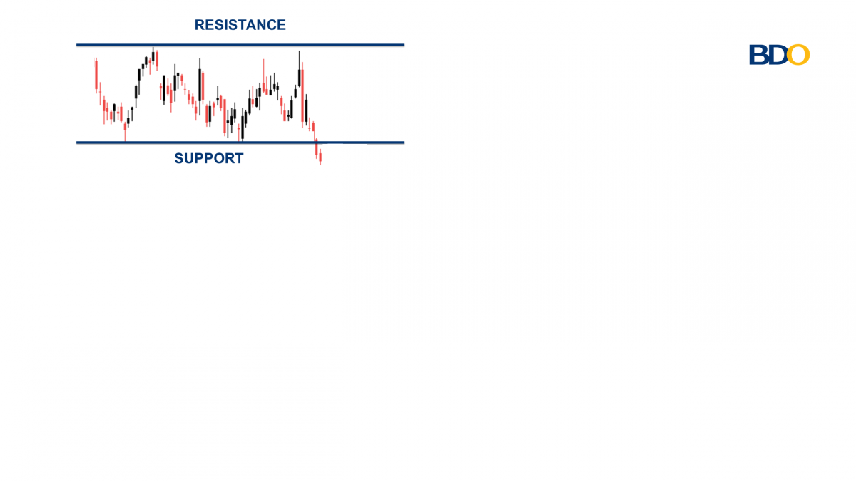
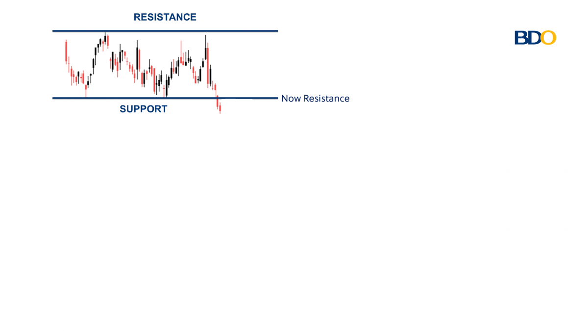
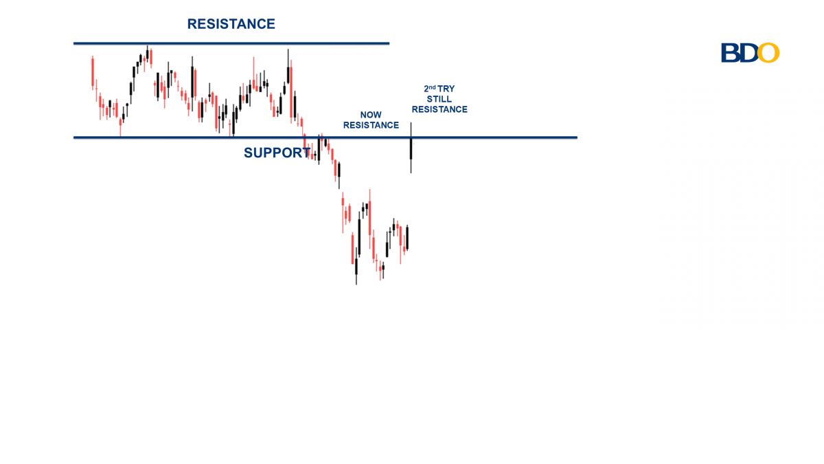
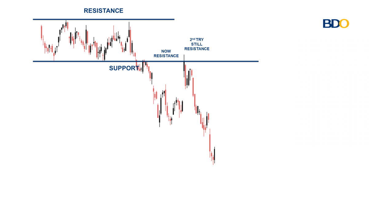
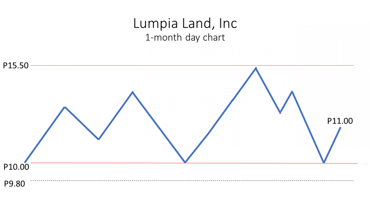
Another important trend for traders is support and resistance.
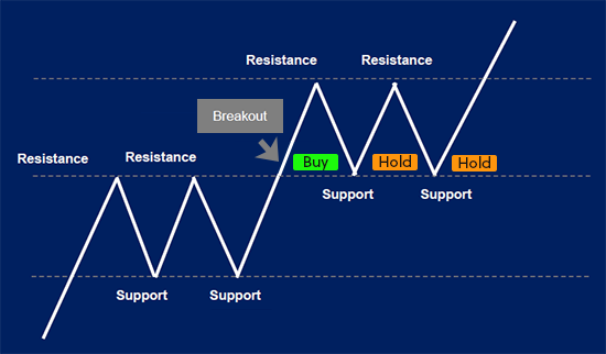
Above you can see a graphic depicting support and resistance. A trader would buy after a breakout of resistance. The trader holds the investment when it’s close to support and sells after a breakdown under the support line. Another important tool for trend analysis is the trend line and channel line.
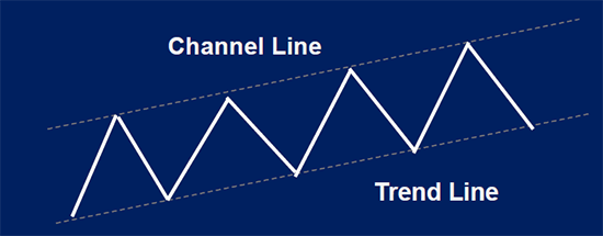
You can see above an example of the trend line (bottom) and the channel line (top). Like the support and resistance lines, the trendline and channel line can help traders decide where to buy and sell a stock.
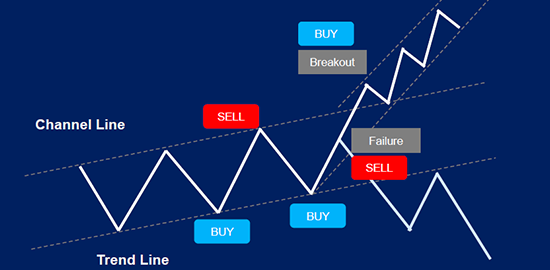
If the stock breaks through the channel or the trend line, this could lead to the purchase or sale of the stock. Above you can see the breakout so the trader buys the stock. However, be careful of a throwover, which you can see above did not actually lead to a breakout.
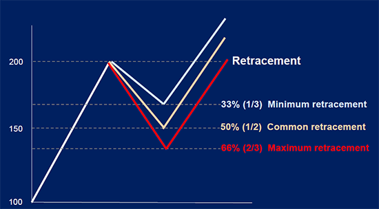
Another important trend is called Fibonacci Retracement. This is a tool applied by traders to project the retracement of a stock price. There are common retracements seen in stock prices and they often fall into the 33%, 50% and 66% levels. Meaning that a stock may retrace down or up by one of these percentages. Traders will use these retracement levels to plan their entry and exit points.
If you look at the white line above, you will see the retracement is drawn after it hits the 200 price point. The subsequent white line, tan line, and red line, show the potential retracement levels. These are the levels you may use for support lines. While the Fibonacci Retracement above shows a negative retracement, Fibonacci can also be used for positive retracement. With a positive retracement, you would use the lines as resistance lines instead of support lines.
Other Technical Indicators
While we touched on some tools utilized by traders above, there are a handful of other technical indicators applied by traders. These tools range from trading volume and moving averages, to oscillators.
Volume
The volume is the amount of shares traded over a given period, which is crucial information for the selling/buying of stocks. Volume analysis is the technique of assessing the health of a trend based on volume activity. The volume indicator is the most popular indicator used by market technicians.
Below shows a stock’s price movement (candlestick chart) and the volume of the stock.
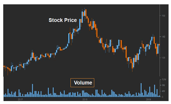
The blue bars at the bottom of the above chart represent the volume. Comparing the volume of trades to certain movements is an important aspect of trading and technical analysis since some predictive patterns and trends may rely on volume.
Volume indications
A rise in volume indicates that
- Market participants are interested in seeing the price go higher in an uptrend and are willing to buy higher in order to participate in upcoming market action.
- Market participants are interested in seeing prices go lower in a downtrend and are willing to sell lower in order to participate in the upcoming market action.
A decline in volume indicates
- Market participants are losing interest in seeing the price go higher in an uptrend and are more willing to buy lower.
- Market participants are losing interest in seeing the price go lower in a downtrend and are more willing to sell higher.
Volume is a very important factor for most trades. Another popular technical tool is called the moving average.
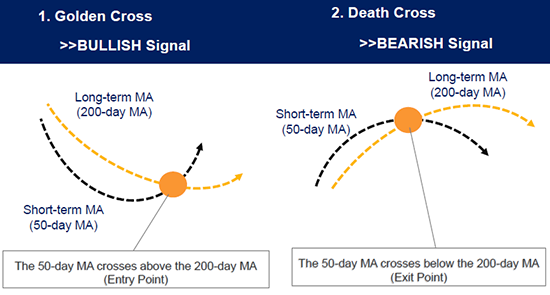
Moving Averages
Moving averages (MA) are widely used indicators used to identify trends, execute trades, and act as support and resistance. MA is the price of a stock averaged out over time, giving a smoother line than the individual prices that are more volatile due to short-term “noise”. Long-term traders often look at the 50-, 100- and 200- day simple moving average (SMA). Short-term traders prefer the 5- and 20-day MA as these represent a week and a month.
3 types of moving averages
- Simple moving average (SMA): The SMA is by far the most common moving average. It simply takes the closing stock price and averages it out over a period of time.
- Weighted moving average (WMA): The WMA puts more weight on the most recent data.
- Exponential moving average (EMA): The EMA places greater weighting on the most recent data but it also considers the data set. This is widely used by more experienced traders.
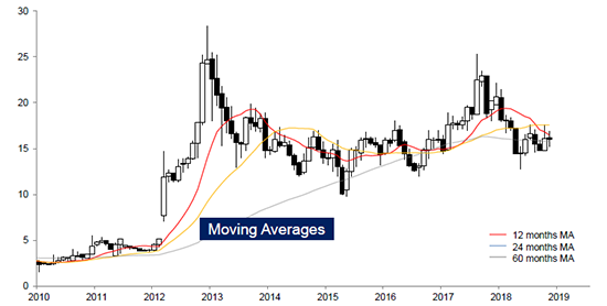
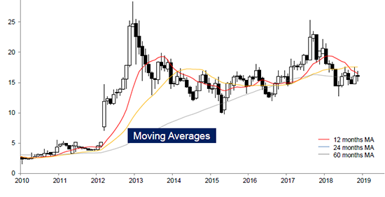
The above chart shows the price movement of a stock over a ten-year period. As you can see, the red line is the 12-month MA, the blue line is the 24-month MA, and the grey line is the 60-month MA. You may notice that the stock has times when it is trading much higher than the moving averages and times when it’s trading lower than the moving averages. The moving averages can also act as a form of support and resistance for stock prices.
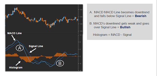
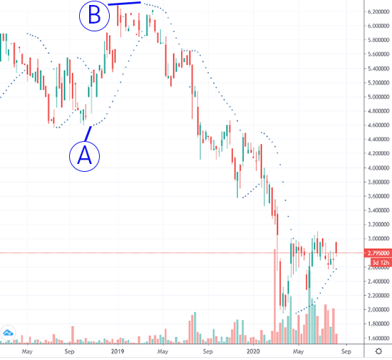
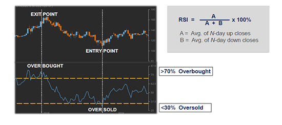
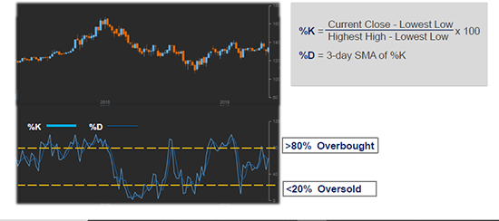
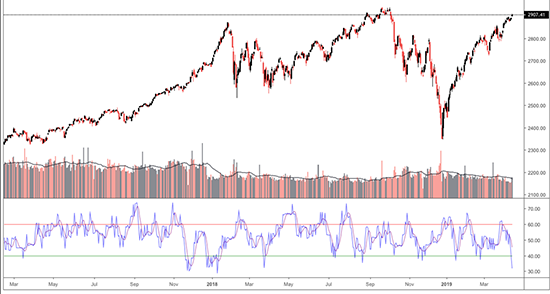
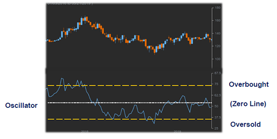
Oscillators
An oscillator is a secondary indicator that varies over time within a band. Oscillators are used to discover short periods of overbought or oversold conditions.
- An oscillator is most useful when its value has reached an extreme reading near the upper or lower end of its boundaries.
- A divergence between the oscillators and the price action when the oscillator is in an extreme position is usually an important indicator.
- Crossing the zero line can be an important trading signal in the direction of the price trend.
Examples of oscillators:
- Relative Strength Index (RSI)
- Moving Average Convergence Divergence (MACD)
- Stochastics
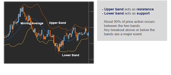
- Bollinger Bands
Technical Checklist
To help you manage some of the important factors of technical analysis, the below checklist can be used. Note that this is not an all-inclusive checklist, but a recommended checklist.
Technical Checklist
- What is the direction of the main/sector indices?
- What are the weekly and monthly continuation charts showing?
- Are the major, intermediate, and minor trends up, down, or sideways?
- Where are the important support and resistance levels?
- Where are the important trend lines or channels?
- Is volume confirming the price action?
- Where are the 33%, 50% and 66% retracements?
- Are there any price gaps and what type are they?
- Are there any major reversal/continuation patterns visible?
- What are the price objectives from those patterns?
- Which way are the moving averages pointing?
- Are the oscillators overbought or oversold?
- Are any divergences apparent on the oscillators?
- Are there any cycle tops or bottoms due?
- Is the market showing right or left translation?
After you’ve arrived at a bullish or bearish conclusion, ask yourself the following questions.
- Which way will the market trend over the next 1-3 months?
- Am I going to buy or sell this market?
- How many shares will I trade?
- How much am I prepared to risk if I’m wrong?
- What is my profit objective?
- Where will I enter the market?
- What type of order will I use?
- Where will I place my protective stop?
Remember that the above list is not all-inclusive but a recommended set of points to check before making your trades.
Conclusion
While there is a lot to learn about technical analysis, it’s something that nearly everyone can grasp. Learning the patterns and trends as well as the different tools that you have at your disposal, can help you become a more confident trader, and potentially a more profitable trader as well.
While we didn’t touch on risk management in this article, it’s as important (likely more important) than all of the patterns and trends and charts we’ve mentioned here. Creating a trade plan and managing risk efficiently is something that all traders should do as they buy and sell positions.
It is HIGHLY recommended to watch our “Choosing your Risk Management Strategy” video by clicking here: https://www.youtube.com/watch?v=K_2Um6SXLso
Thanks for reading this intro to technical analysis and good luck with your trading and investment endeavor.